Self-service Hotel Modification
Costco Travel
Deliverables: workflow to allow users to make changes to their hotel bookings online. Includes payment/payment reduction designs.
Platform(s): Figma, User Testing
My role: UX Designer, UX Researcher
The problem
The lack of self-service availability was driving calls to the call center and increasing agent hold times. The company‘s fiscal goal was to work on self-service improvements that would reduce calls and hold times to ensure for a smoother user experience.
An ongoing department goal for the technology department at Costco Travel has been to reduce calls to the call center by focusing on the main call drivers: self-service updates. The first branch within self-service modifications was to tackle hotel booking changes, which would also include establishing all payment change scenarios for all of the following self-service scenarios.
Evaluating our current booking workflow
Doing a foundational analysis of how users are proceeding through the current booking workflow allowed me to gauge any usability issues that may arise. It also let me to predict how successful a modification flow based on the original booking flow may be. If any major interaction or usability concerns come up, I could address them in the newly designed scenarios.
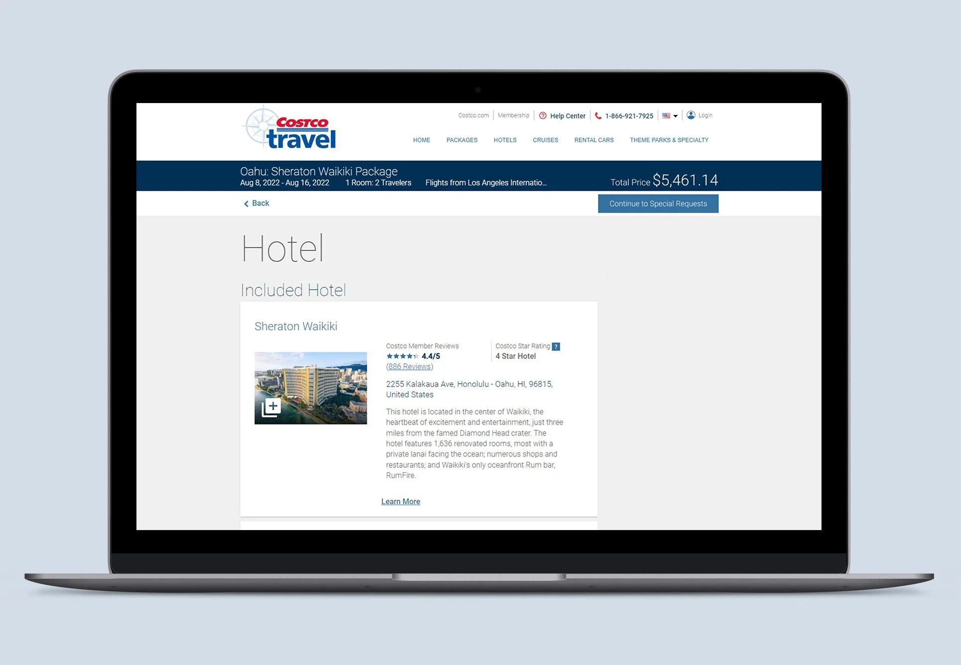
This was the live booking workflow that we tested with users.
1. Reduce calls to Costco Travel agents that are being driven due to hotel room change requests
2. Evaluate current flows to understand current usability feedback on how users can change their room
3. Add payment scenarios depending on package price increases, decreases, and refunds
Business objectives for UX
4. Communicate error messaging if changes aren’t available, will incur an extra fee or be nonrefundable.
5. Allow users to pay later for added room costs.
6. Allow users to pay with the same credit card they previously booked with.

What I learned from users

Through testing I learned that users wanted to be able to make changes to their hotel rooms, no matter if it was a multi-room or multi-hotel booking, within the same edit workflow.
Users expect to see a room modification entry point next to their room information, not the general hotel information.
For saved payment cards, users expected input fields for new card information to be collapsed, rather than expanded and readily available to them.


In the first round of user testing the entry point for the change process was placed where similar entry points for other work flows were located. The findings showed that users naturally scrolled to their room information to make a change to their room bookings. It took several scrolls and some confusion for users to find the entry point in this original location.
After moving the “Edit Hotel Room” link to be next to the room information, 10/10 users easily found and clicked into the room change process. The design still followed the styling of the other entry points, but proved for a more successful user interaction.
Further explorations
Preliminary sketches of the UI and navigation between the different functionalities in the app based on the user flow created (note the health portion of the app was deprioritized and replaced with reminders).
The flow and usability were tested on the Marvel phone app.

Through user testing, I was able to discover key issues that directly translated into my next iterations:
Making categories and headings more distinguishable. Users needed reminders of what page they were on and what information they were editing.
One of the main goals of our persona was to save time and get to the information quickly. This was reiterated in the testing with users mentioning sections needed to be minimizable.
Iteration 2 and usability testing

Iteration 3
Direct user feedback on my low-fidelity designs influenced the directions I took for the designs moving forward. More feedback I received was:
Ability to rearrange list items
Making typable options more clear

Semi-final design

+ visual design

After going through 3 usability tests and being content with the user experience and interaction of the app, I was ready to do a last take on the visual design of the app.
There was confusion on why the Goals and Reminders sections were the same color, but all other categories had a distinct color.
Youdo! is an app tailored for you and about you. Their settings was moved to an overall account/profile icon in the top right corner.
The purpose of the app was to bring together each of these distinct features to work together in one location. The colors for the icons were removed as the colors were not utilized in later parts of the workflow.
I refined the search bar at the bottom of the page to match the color scheme and style of the app.
The alignment of checkboxes and headers was fixed in later pages of the workflow to help distinguish categories and line items.